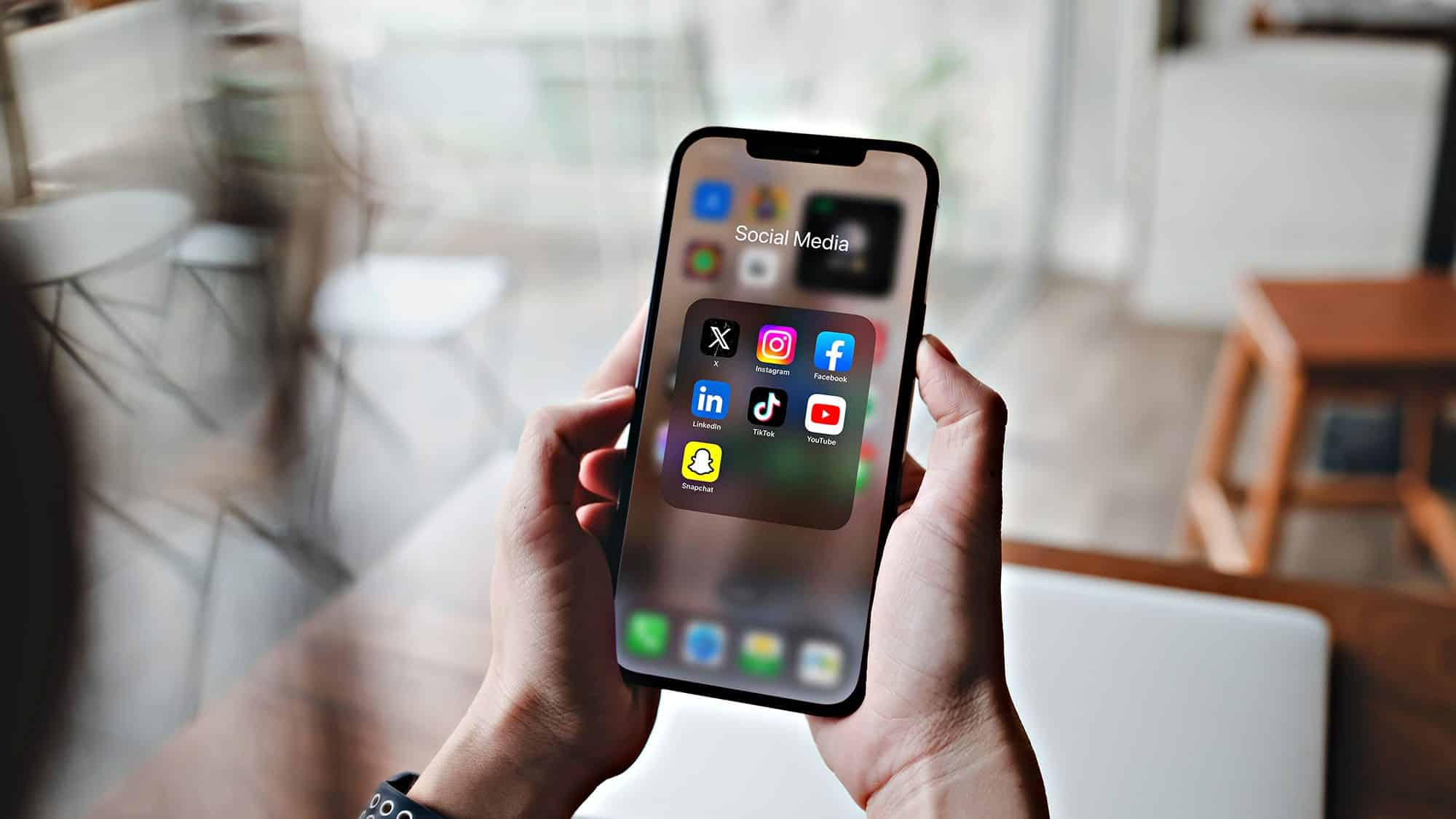
Elevate User Experience
on Smartphones and Android Devices
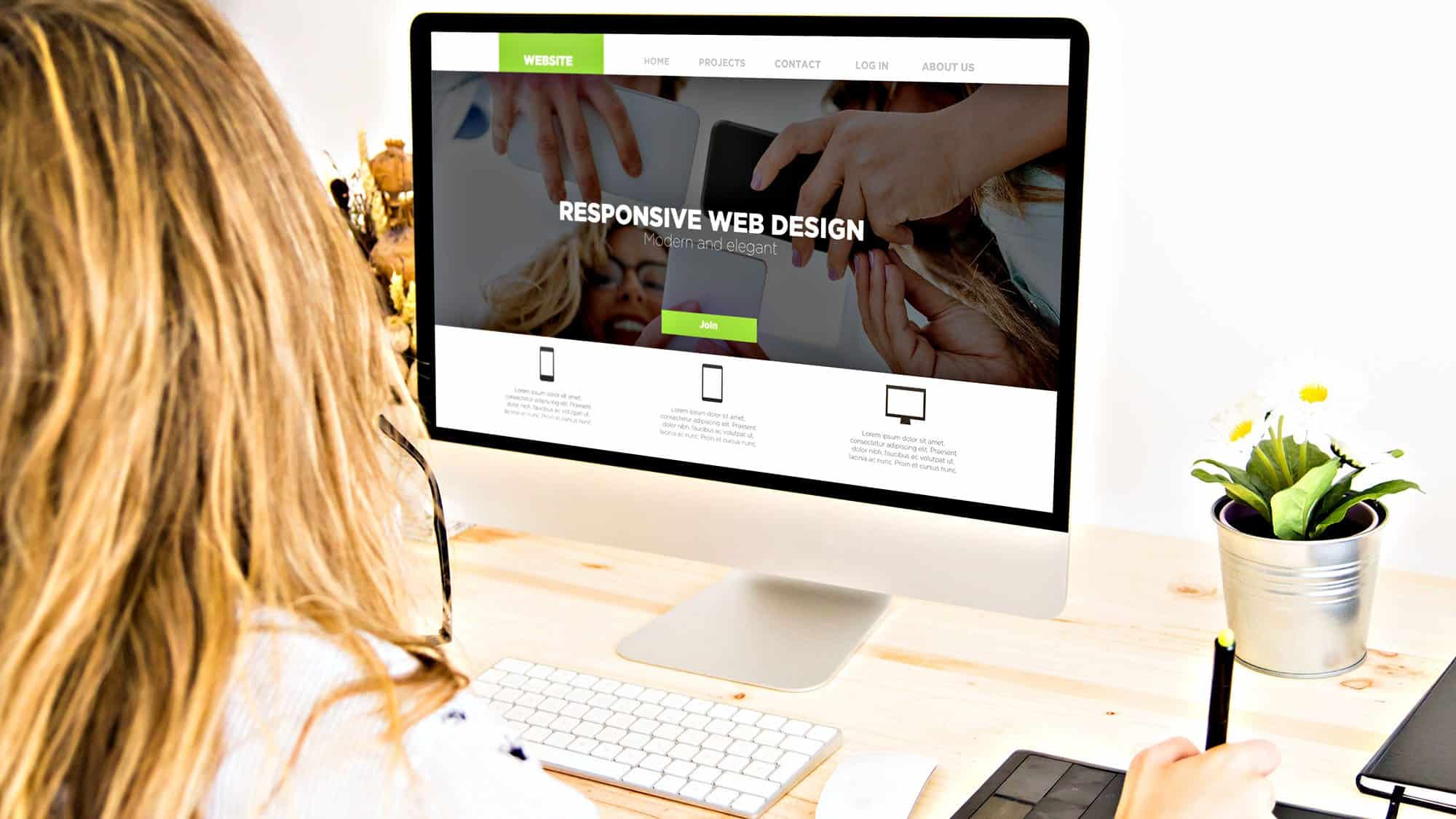
As more and more website visitors are using mobile devices, Web Dezyn Plus has discovered and learned the essentials of mobile-first design and how prioritizing user experience on mobile devices can enhance engagement and boost conversion rates.
This is why focusing on mobile-first design improves user experience, engagement, and conversion rates.
Understanding the Importance of Mobile-First Design
Mobile-first design refers to the practice of designing websites and applications with a primary focus on mobile devices before scaling up to larger screens like tablets and desktops. This approach is critical, as
mobile devices now account for over 60% of global web traffic, making it essential for businesses to engage effectively with users on their smartphones and other mobile devices. The concept was popularized by Luke Wroblewski in 2009, who emphasized starting the
design process with the smallest screen sizes to ensure that essential content is prioritized and accessible.
Research shows that users are prone to abandon a site if it takes longer than three seconds to load on mobile devices, highlighting the need for a fast and efficient mobile experience. Additionally, as consumer behaviours shift, with 79% of smartphone and mobile device users making purchases through their devices, having a well-optimized mobile site is no longer optional but a necessity for businesses aiming to capture this market segment.
Web Dezyn Plus is very capable in creating websites on these mobile devices.
Principles of Mobile-First Design
The principles of mobile-first design centre around creating a seamless and user-centric experience on smaller screens. One key principle is simplicity, which involves using white space effectively and limiting navigation items to enhance clarity and usability. For instance, a well-designed mobile site for an e-commerce platform might showcase a few featured products on the home page, allowing users to quickly browse without overwhelming them with choices.
Visual hierarchy is another crucial aspect, ensuring that vital information is easily identifiable using headings and distinct text styles. Moreover, the design must be “fat-finger-friendly,” meaning that tap targets like buttons and links should be at least 30px wide to accommodate touch inputs comfortably. Additionally, content should be organized to allow for quick scanning, with critical information placed above the fold for immediate visibility, ensuring that users can access what they need without excessive scrolling.
Benefits of Adopting Mobile-First Design
Adopting a
mobile-first design approach offers numerous advantages, including improved user experience, faster load times, and enhanced search engine rankings due to the prioritization of essential content. Companies like Google and Dropbox have reported notable increases in user engagement after implementing
mobile-first strategies, demonstrating its effectiveness in meeting user needs.
Furthermore, mobile-first design can lead to significantly lower bounce rates, sometimes up to 50%, as sites are tailored specifically to mobile users. Improved load times, a direct result of focusing on mobile optimization, can also boost conversion rates by up to 20%, making this approach not only beneficial for user experience but also financially advantageous for businesses.
Best Practices for Implementing Mobile-First Design
To effectively implement mobile-first design in web projects, Web Dezyn Plus knows it is essential to prioritize content and focus on essential features while avoiding unnecessary elements that could clutter the interface. An intuitive mobile navigation pattern, like a hamburger menu, can facilitate ease of use for mobile users, allowing them to access various sections of the site without confusion.
Regular testing on real mobile devices is crucial to gather user insights and feedback, enabling continuous improvement of the design is an on-going feature of all websites created by Web Dezyn Plus.
Additionally, optimizing images and graphics for mobile is vital to reduce loading times without sacrificing quality. Performance optimization strategies, such as minimizing server requests and compressing files, can further enhance speed and efficiency.
Mobile-First Design vs. Responsive Design
Mobile-first design differs from traditional responsive design in that it begins with the smallest screen sizes and scales up, whereas responsive design adapts layouts based on varying screen sizes after the initial desktop design is created. This approach ensures that core functionalities are accessible to all users, embodying the principle of progressive enhancement.
Moreover, search engines like Google favour mobile-friendly sites, making mobile-first design a critical factor for SEO rankings. While responsive design can sometimes result in bloated pages due to the inclusion of desktop elements, mobile-first design maintains a leaner, more efficient approach that prioritises user experience on mobile devices.
Tools for Mobile-First Design
Several tools can assist designers like Gail Kenney of Web Dezyn Plus in creating effective mobile-first designs. Software such as Sketch, Figma, and Adobe XD are popular for their user-friendly interfaces that cater specifically to mobile-first design principles. Additionally, BrowserStack allows us to test our mobile-first designs across various devices and browsers, ensuring optimal compatibility.
Frameworks like Bootstrap can provide pre-built responsive components that streamline the design process, while tools like Google’s Mobile-Friendly Test can evaluate how well a site performs on mobile devices, offering actionable insights for improvements. Design systems such as Material Design also offer guidelines and components tailored specifically for mobile-first implementations, aiding in the design process.
Although we don’t use all of these tools, Web Dezyn Plus team members use a variety of different software applications to test our mobile-friendly websites before releasing them to our clients.
The Future of Mobile-First Design
Selecting Web Dezyn Plus for your new mobile-friendly web design provides many advantages including fast-loading, dynamic user experiences and most importantly, increasing client interactions with your business.
Book a consultation with Web Dezyn Plus to discuss your specific requirements, especially if your current website is over three (3) years old. The web and devices have changed dramatically and so have your website visitors. Let’s explore how Web Dezyn Plus can assist in achieving a modern, mobile-ready website today.
Give us at call at 1-705-955-8574, send her an e-mail at gail@webdezynplus.ca or fill out the form below. We would be delighted to chat with you about all of your website needs.
Cheers!


